If your landing page is not converting your website visitors into leads, then it really hasn’t served its purpose.
1. Place calls to action strategically
When someone lands on your page and is ready to buy, you want to make sure it’s really easy for them to take that next step. Calls to action (CTA) like ‘call us’ ‘request a demo’ or ‘buy now’ shouldn’t be hard to find. Here’s some common CTA placements that can help to generate more leads.
Calls to action in the header
CTA buttons
Plenty of websites have call to action buttons in their website header and it’s easy to see why. If designed correctly, they’re hard for visitors to miss, especially because they’re sitting ‘above the fold’. These buttons should include engaging, action oriented language such as ‘chat to a specialist’, ‘shop the collection now’ or ‘start your free trial’.
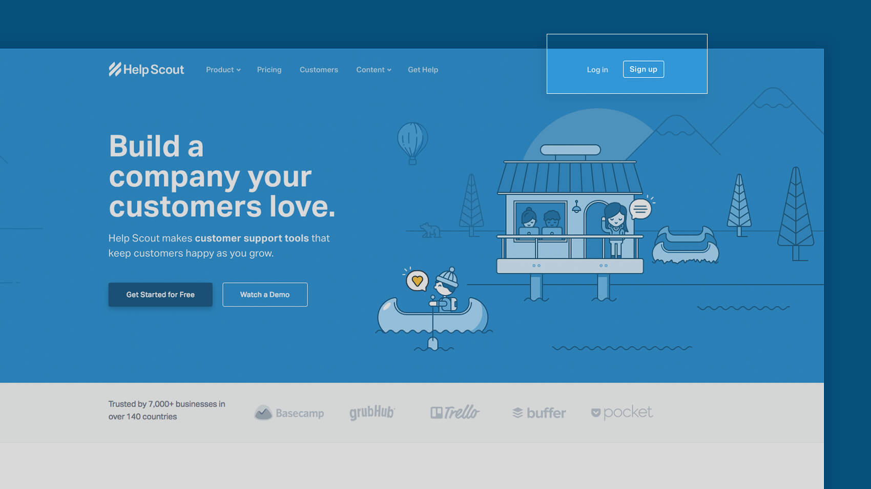
You’ll need to ensure your CTA is a decent, visible size, looks ‘clickable’ and is a colour that stands out on the page. I find complementary colours (opposites on the colour wheel) often work well, but that’s not a hard and fast rule. Not sure if your button is making the grade? Squint and see what ‘pops’ on the page. It should be your CTA button!
Phone numbers
If your goal is to get people to contact you, a phone number in the header will make it easy for your website visitors to do so. Better yet, make your phone number a link, and on mobiles, a customer can simply click on the phone number in the header to call you directly.
Calls to action in the body
Sticky buttons
With the recent advancements in CSS3 and browser upgrades, you can make your CTA follow the user, rather than have them seek it out. Enter the ‘sticky button’—a small button that remains attached to the side or bottom of the browser as the user scrolls down the page. This makes it easy for your visitor to take the next step, when they’re ready.
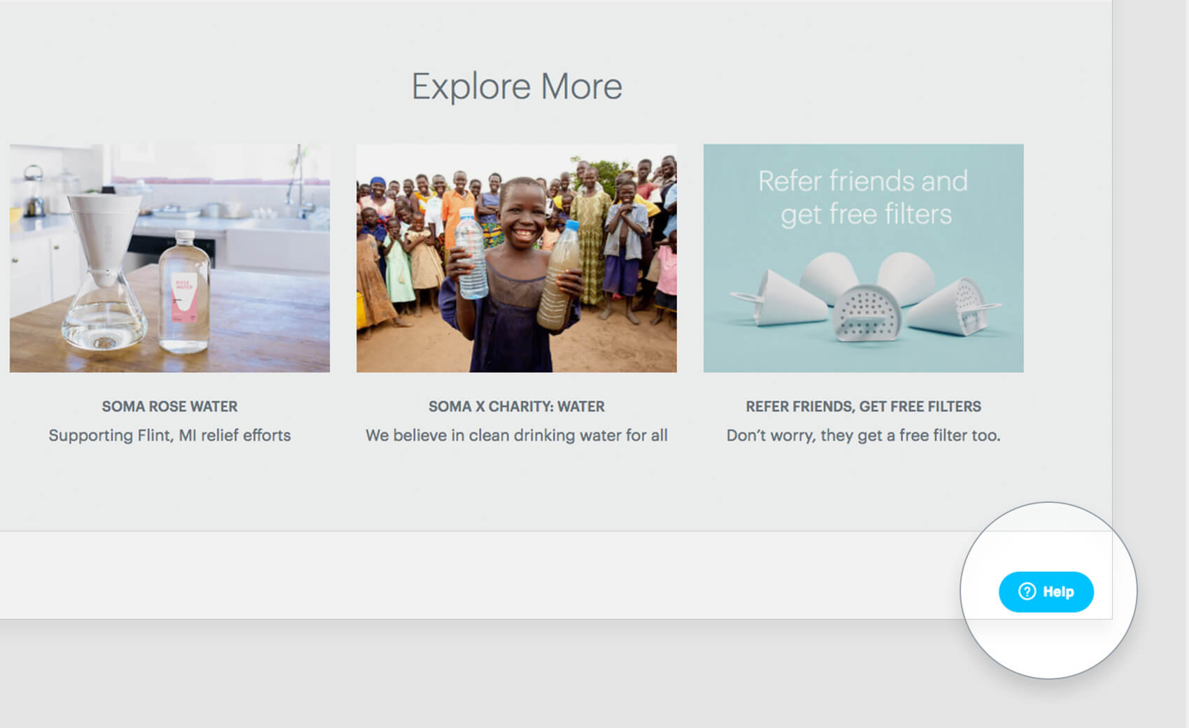
If you do decide to use a sticky button, I would suggest disabling it for mobile users as the small screen size makes it annoying, nullifying its subtle convenience.
Repeat CTAs
For long, scrolling pages ensure your CTAs are repeated a couple of times throughout the page. Your user shouldn’t have to scroll back to the top or go searching for another page to complete your conversion action. Make your website experience as easy and convenient as possible.
If you’re after more tips on on how to optimise your calls to action, this best CTA practices article from Wordstream is a good read.
2. Make navigating a breeze
The key to outstanding service is predicting customer needs or problems before they occur and ensuring you’re prepared to accommodate them. As a website owner, you should be asking, what is my customer expecting from this page and what action will they want to take next? When you think about it strategically, you can better serve your site visitors by placing links, menus, CTAs or information in the right place, at the right time. This will make it easy for them to navigate your site and complete the conversion action that you’re hoping for.
Some simple hacks for making navigation easy include:
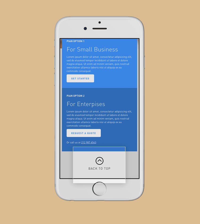
Back to top buttons:
This thoughtful little button will involve less scrolling—a big win for mobile users.
Sticky navigation:
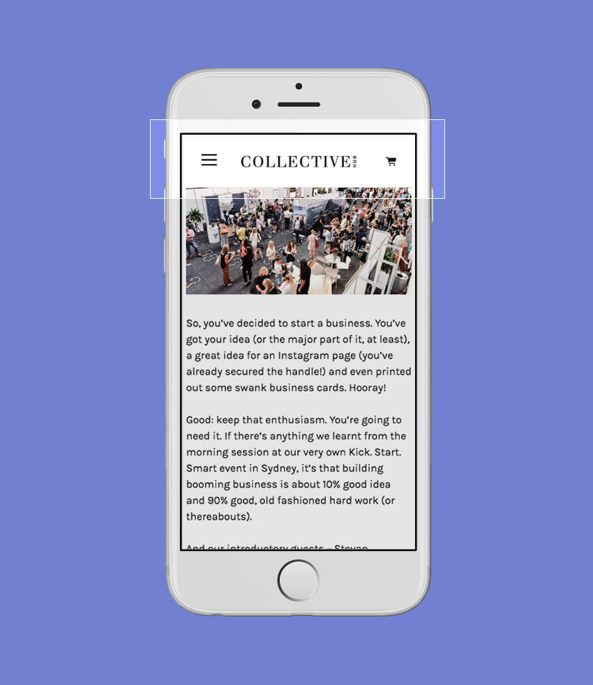
Sticky navigations ensure your menu is always available, by ‘sticking’ the navigation menu to the top of the page, even as you scroll. This is a fairly popular trend, especially with a lot of template websites. If done correctly and tactfully it can work very well, but be careful it doesn’t take up too much screen space, especially on mobile devices.
Related pages or posts:
If your visitor is interested in a certain type of content, you can keep them engaged on your site by making helpful suggestions about what they might want to see or do next.
3. Optimise your forms
The form submission— for many of us, it’s the point where a visitor turns into a lead or customer. Often the act of filling out a form, whether it’s a contact form, payment information or subscription form, is the action you’re hoping visitors will take on your website. So, you’ll want to make sure this process is simple, easy and intuitive (are you sensing a trend here?).
Form positioning
The location of your forms will likely depend on how your visitors will be interacting with your page and the type of form you’re using. Think about your visitor, where they are coming from and what they might be looking for on your website.
Above the fold
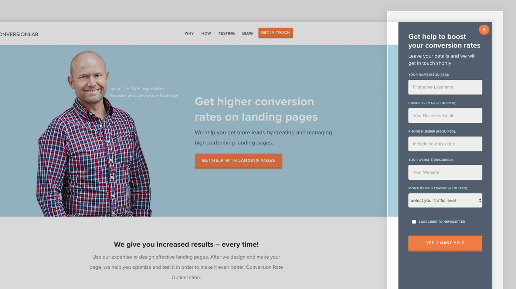
Perfect for landing pages, putting your form above the fold (or right at the top of the page) entices immediate action. This is great if you are driving traffic to your page from advertising campaigns and you know your visitor is ready to convert.
Below the fold
You may opt for forms below the fold, midway or at the bottom of the page too. These are useful if your product or service needs a bit more explaining or if you need your visitor to digest the content on the page before they will be ready to convert. A good example of this is a subscription form at the bottom of a blog post. You’re letting your reader digest the content and decide if they’re enjoying it, before suggesting that they subscribe.
Pop-up forms
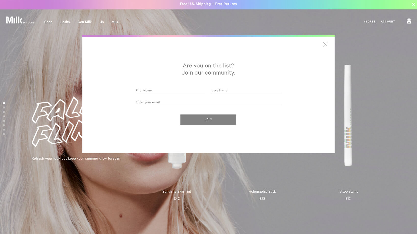
When used strategically and thoughtfully, pop-up forms can work well. For example, a pop-up form to subscribe when someone has read a few blog posts can be very effective. Use these with caution and avoid using them on mobile, as Google has begun penalising sites using mobile pop-ups.
Keep it proportional
Your form fields should be directly proportional to the transaction taking place. The more valuable the transaction to the visitor, the more likely they’ll be to fill out more fields. For example I’m not likely to share my phone number to download an infographic, but I might if I’m requesting a quote. Removing unneeded fields and only requesting what’s necessary at that time may encourage more people to fill out your form.
The submission process
The conversion never happened if they don’t hit submit! Reduce your abandonment rate by:
- Reminding them of the value: In the final stages of filling out a form you want to remind the viewer the value they’ll be getting by completing the form. Try using something like “Download this ebook” or “Sign me up” instead of ‘submit’. Unbounce suggests that using the word ‘submit’ can reduce conversions by 3%. Language can be powerful.
- Line them up: I generally like to keep the ‘submit’ button left-aligned on the page. While some might disagree, I reason that we read from left to right so it makes sense from a UX point of view to place the button where our eye naturally goes.
- Colour choice: Like the CTA button, make sure it’s easy to see your submission button on the page. There shouldn’t be any guesswork here.
Strategically placing calls to action, making navigation easy and optimising your forms are three simple and easy hacks that you can make to help to gain more leads from your website. Have questions or ideas to share? Let me know in the comments!
